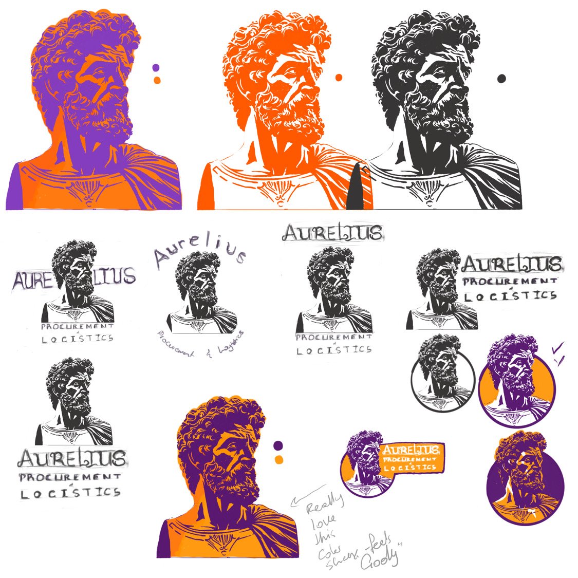
For the rebranding project of Aurelius PL, a Miami-based logistics company, we took inspiration from the Roman emperor Marcus Aurelius for the company's name and visual identity. The logo was based on his face, starting with initial sketches incorporating word placement. After approval from the client, we moved on to selecting colors. We refined the palette from the previous logo, choosing gold and dark purple to convey luxury, wealth, and royalty. The font selection was done by the client to ensure a cohesive final design.